Styling API Details Info Section
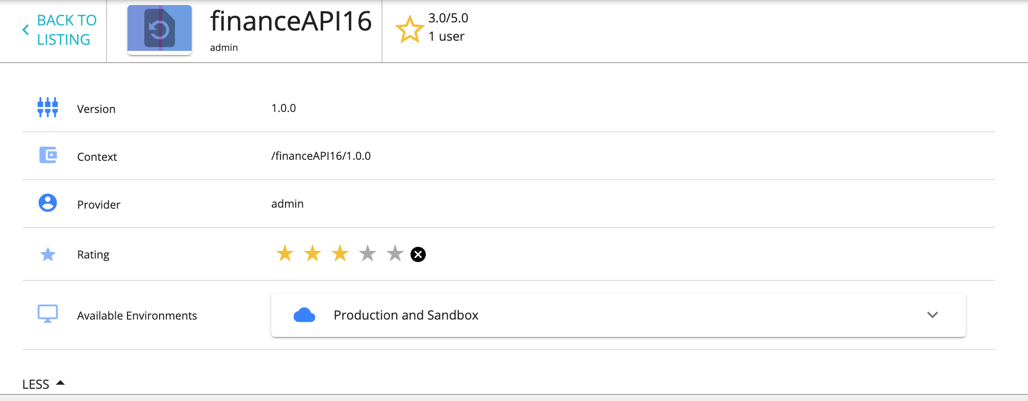
The "API Details Info" section which is shown below can be customized according to your design needs by configuring the defaultTheme.js file.
The defaultTheme.js file has all the parameters defining the look and feel of the developer portal. To learn more about defaultTheme.js refer here.
Edit the attributes in themes.light.custom.infoBar by following the below steps to change the styling of "API Details Info" section and the "Application Details Info" section.
-
Open the
<API-M_HOME>/repository/deployment/server/jaggeryapps/devportal/site/public/theme/defaultTheme.jsfile in a text editor and update thethemes.light.custom.infoBarattributes. -
Refresh the Developer Portal to view the changes.
The following attributes are available for infoBar
The JSON sample code that is given below defines the default look and feel.
const Configurations = {
    custom: {
        infoBar: {
            height: 70,
            background: '#ffffff',
            showThumbnail: true,
            starColor: '#f6bf21',
            sliderBackground: '#ffffff',
            iconOddColor: '#347eff',
            iconEvenColor: '#89b4ff',
            listGridSelectedColor: '#347eff',
            tagChipBackground: '#7dd7f5',
        },
    },
};
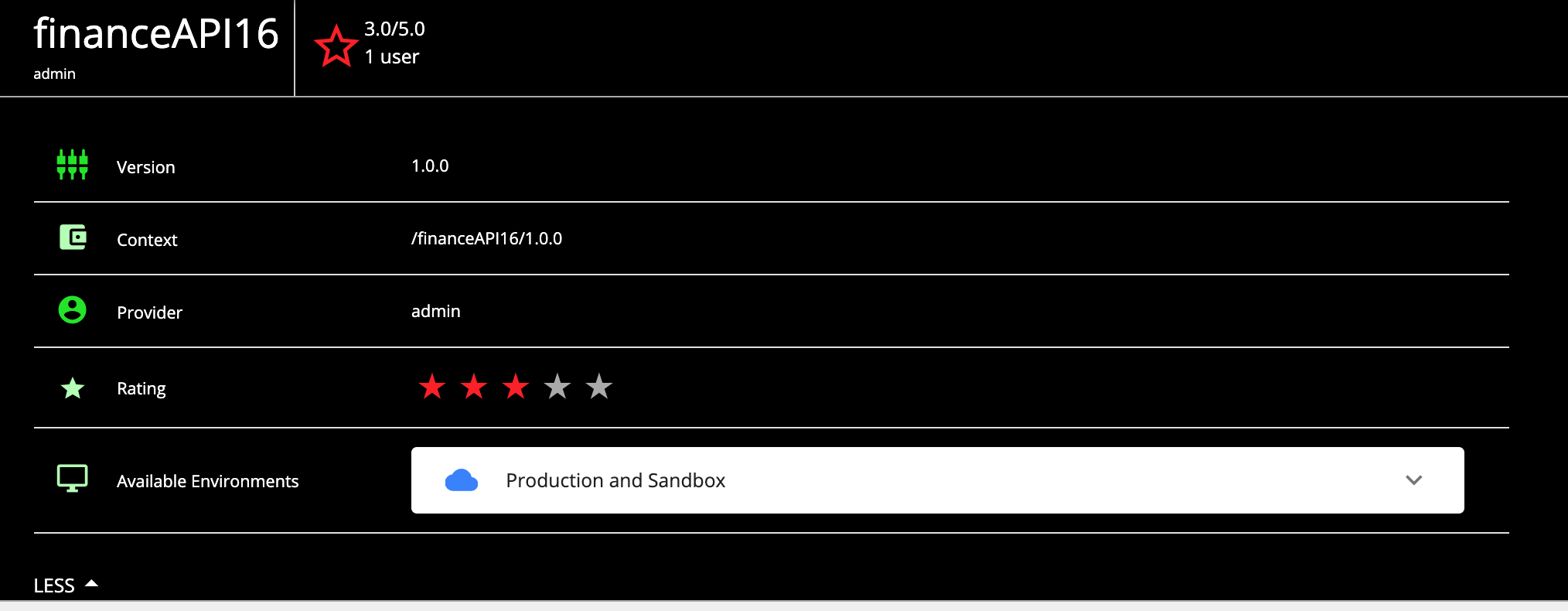
Example: Change the colors of UI elements
const Configurations = {
    custom: {
        infoBar: {
            height: 70,
            background: '#000',
            showThumbnail: false,
            starColor: '#ff1a1a',
            sliderBackground: '#000',
            iconOddColor: '#00e600',
            iconEvenColor: '#b3ffb3',
        },
    },
};
Attribute options
| Option | type | Description |
|---|---|---|
| height | integer | Height of the top most row with the API name up to the API link, given in pixels. |
| background | string | Background color of the component |
| showThumbnail | boolean | Show/hide the API thumbnail. Set to visible, by default. |
| starColor | string | Set the color of the star rating. |
| sliderBackground | string | Set the background color of the 'SHOW'/'HIDE' collapsible section at the bottom. |
| iconOddColor | string | Change the color of the icons displayed on the left of the odd-numbered rows. |
| iconEvenColor | string | Change the color of the icons displayed on the left of the even-numbered rows. |
| listGridSelectedColor | string | Define the color of a selected icon (Grid/List) view of the API listing page. |
| tagChipBackground | string | Change the background color of the tags. |
You can handle most of the use cases with regard to rebranding using these configurations. However, if you need to make a change that is not supported by the defaultTheme.js file, then you need to override the relevant React component. For more information, see Advanced Customization for more information.
Known issues and workarounds
The API details page tags are not visible- https://github.com/wso2/product-apim/issues/7849.
As a workaround, add the following to the <API-M_HOME>/repository/deployment/server/jaggeryapps/devportal/site/public/theme/defaultTheme.js file.
const Configurations = {
    custom: {
        tagWise: {
            active: true,
        },
    },
};
