Advanced UI Customization
The user interface of the WSO2 API-M Developer Portal and Publisher Portal can be customized simply without editing the React codebase or the CSS in most cases. You will be required to modify the React codebase only if you need to do advanced customizations.
Structure
First, let’s see how the portal’s source code is organized. The Source of the publisher and devportal resides in the following Directory.
<API_MANAGER_ROOT>/repository/deployment/server/jaggeryapps/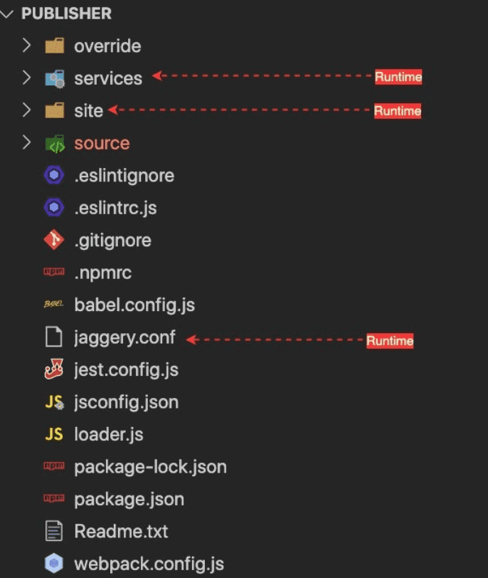
We ship the React apps source code along with the distribution for the customization purpose. Otherwise, You will not need to react application source code in the run time. The basic folder structure is the same for both publisher and devportal. Let’s look at how the source code is organized.
override
This folder is used to organize the React component customizations. This is empty in the default pack(distribution).In short, This is where you put your customizations to override the default React UI components.
services
This directory contains the utility services that are required to run the web portals. Even though the React UI portals are fully client-side rendered(CSR) apps, We still need services or proxies for some operations, Such as
- Authentication
- Reverse proxy
- Custom URLs site
This contains all the static files that are needed to run the portals in the browser. And in fact, this is the directory contains various static files from JS bundles, locale files, theme JSON to favicon. Inside the site, you can find
source
This directory contains the Javascript source codes. It contains both implementation and tests. None of the files in here are used in runtime (get loaded into the browser). Here we have split the implementation into two aspects, Data, and Components. Data contains pure javascript implementations of data handling (REST API innovation), Utility functions, and data models (User class). The purpose of these separations is to make the data handling elements shareable and usable in non- ReactJS based projects. And in the Components directory, we maintain the ReactJS Component implementations. It has the whole component hierarchy of the publisher portal.
jaggery.conf
This is a configuration file used for web apps in Jaggery web server, It contains
routing rules(urlMappings) security constraints welcomeFiles and other jaggery app-related configurations.
If you are new to JaggeryJS, JaggeryJS is a javascript backend server that can render jaggery style .jag (like Pug) templates into HTML. Simply put, It’s like NodeJS + Express
Others
The rest of the files are runtime configurations for eslint, jest, webpack, npm. You would probably recognize them by their names.
Adding advanced UI customizations to WSO2 API-M UIs (Publisher and Developer Portal)
Follow the instructions below to add advanced UI customizations to the Developer Portal and/or Publisher.
Prerequisites
- NodeJS (minimum 8.12.0) - This is a platform required for ReactJS development.
- NPM(minimum 5.7.0)
-
Navigate to the
<API-M_HOME>/repository/deployment/server/jaggeryapps/<APP-ROOT>directory in a terminal and run the following command. (<APP-ROOT>is publisher or devportal )npm ciThis will install the local package dependencies in the publisher/devportal applications.
-
Build with customizations
Run the following command to start the npm build. Note that it will continuously watch for any changes and rebuild the project.
Production deployment
The development build is not optimized and contains a large bundle size. Make sure to use the production build when the customizations are ready for production. Use the following command to get the production-ready build.
npm run build:prod
Overriding files
Any file inside devportal/overrides/ folder can override the original file at devportal/source/ folder. The name of the file and location relative to the source folder has to be identical. This concept applies to publisher app as well. For example, [1] is taking precedence over [2] when the npm build is running.
- [1] - devportal/override/src/app/components/Apis/Details/Documents/Documents.jsx
- [2] - devportal/source/src/app/components/Apis/Details/Documents/Documents.jsx
Adding new files to the override folder
override
└── src
    ├── Readme.txt
    └── app
        └── components
            └── Apis
                └── Details
                    └── Documents
                        ├── Documents.jsx
                        └── NewFile.jsx
You can import the NewFile.jsx by adding the AppOverride prefix to the import and provide the full path relative to the override directory.
import NewFile from 'AppOverride/src/app/components/Apis/Details/Documents/NewFile.jsx';A build error will show up if you try to import the NewFile.jsx from Documents.jsx as follows.
import NewFile from './NewFile.jsx';Production Build vs development build
We need to run the build command once and preview changes during active development. Once we run the following command at the web application root folder, it will continually watch for file changes. It also loads the React source to the browser for debugging purposes. It will make a large javascript bundle size.
npm run build:devMake sure you do a production build after you finish development with the command given below. The output of the production build contains minified javascript files optimized for web browsers.
npm run build:prodNote
Production build by default check ESLint errors. ESLint is a static code analysis tool for identifying problematic patterns found in JavaScript code. We recommend always keep the customizations free from ESLint errors. But it's also possible to ignore these errors and run the production build by commenting out the following from <WEBAPP>/webpack.config.js
const esLintLoader = {
    enforce: 'pre',
    test: /\.(js|jsx)$/,
    loader: 'eslint-loader',
    options: {
        failOnError: true,
        quiet: true,
    },
};
config.module.rules.push(esLintLoader);
Examples
Following examples will let you get familiar with the codebase.
Note
React component overriding is implemented via a custom webpack loader. There are some improvements and bug fixes that went into this customer loader after the product release. If the APIM product is not a WUM updated pack, you can still apply these fixes by replacing the loader.js from the github repo.
You can simply override the file of any of the webapps (publisher, devportal, admin 3.2 onwards). We recommend you to apply this fix before trying out the following samples.
Example 1 - Overriding API Listing Page ( devportal )
Let's see how we can override and display a custom API listing page.
-
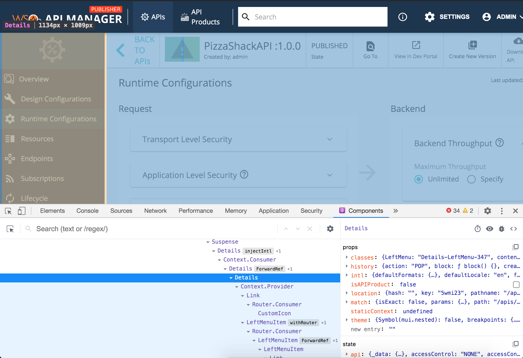
Step 1 - Find the file responsible for rendering the listing view. First of all, we need to find the file responsible for rendering the listing view. We recommend using the Google Chrome browser for testing and debugging the web apps since it provides the best toolset.
Install the React Developer Extension for Chrome browser from here.
Now right click on the Devportal page and click inspect to open the Chrome developer tools. You can also use the shortcut Option + ⌘ + J (on macOS), or Shift + CTRL + J (on Windows/Linux). Click the Components tab from the developer tools panel.
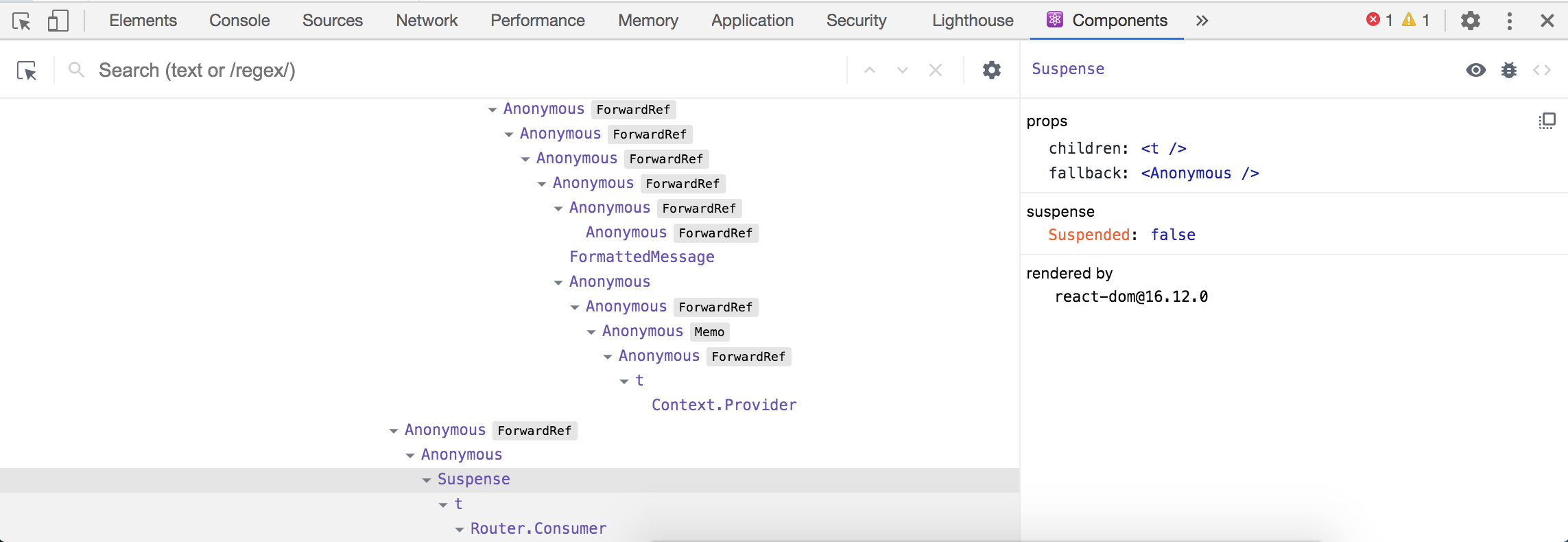
If you see a tree of
<Anonymous>tags, it means that you are running a production build. It's hard to identify the relevant components with a production build. Make sure to run a development build running the following command.npm run build:devNote
You can find out what are the available commands to run by examining the package.json file in the web app root folder.
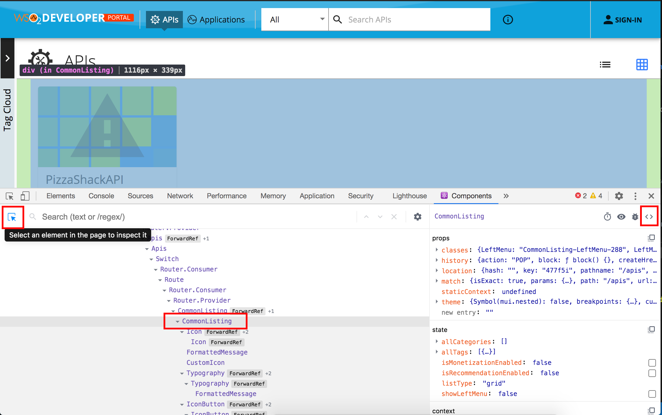
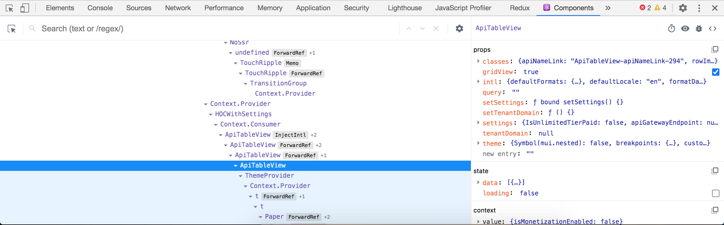
Use the inspect tool to select elements from the UI to inspect. With the development build, we can see what are the components responsible for displaying each section. When it comes to the API listing section we can see mainly the "APIs", "CommonListing" and "ApiTableView" components are responsible for rendering the view. You can use the small
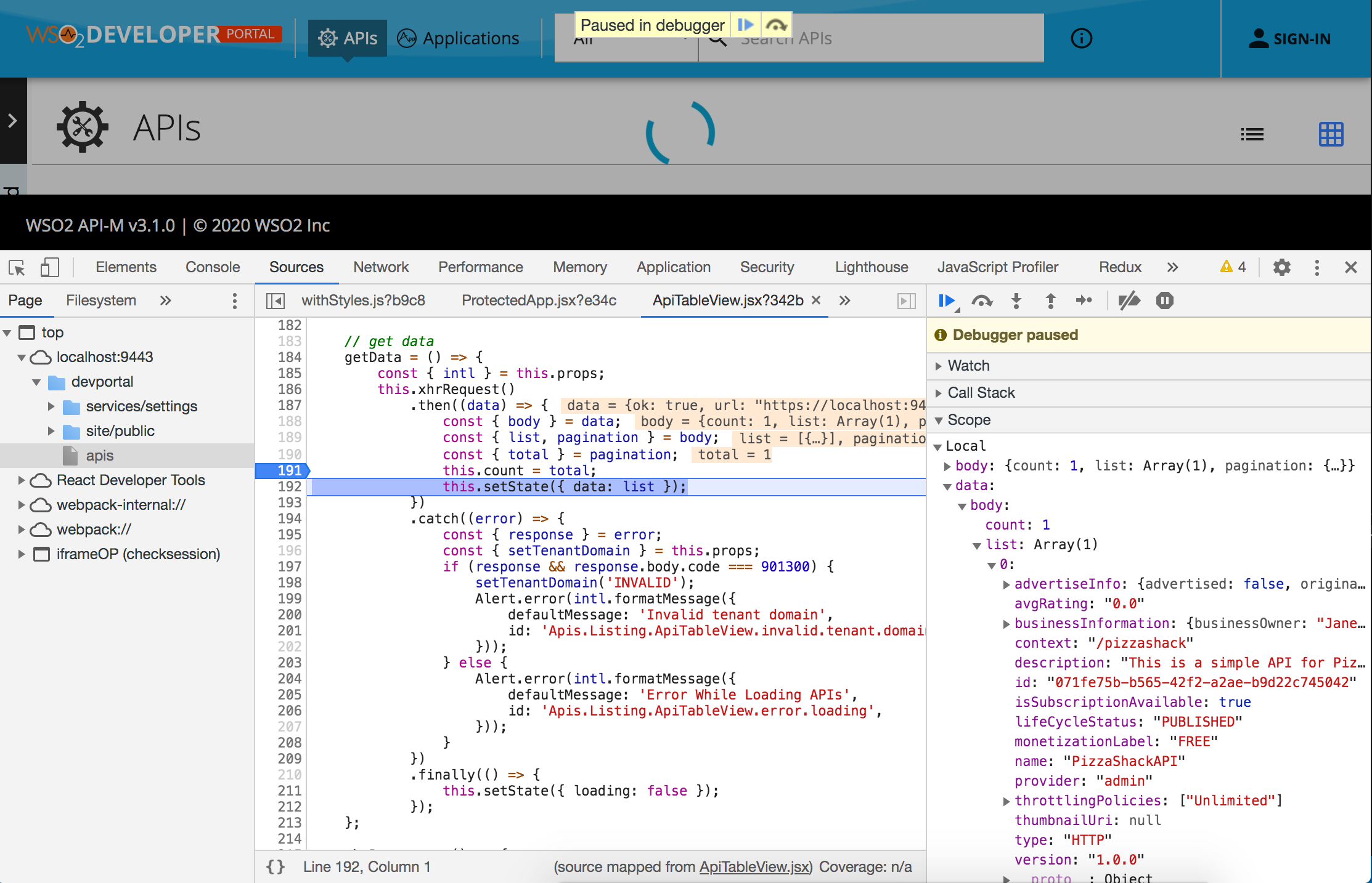
<>icon on the right-hand side to navigate to the source.We can set debug points to inspect the data used to render the list by clicking on the line numbers.
-
Step 2 - Now let's override the APITableView.jsx.
Open the "devportal" folder from your favorite IDE. For this example, we are using the Visual Studio Code.
The complete path for the APITableView.jsx relative to the web app root is as follows.
devportal/source/src/app/components/Apis/Listing/ApiTableView.jsxWe need to create a copy of the same file in the following location before doing any modifications to it.
devportal/overrides/src/app/components/Apis/Listing/Since we add a new file, we need to restart the npm build to let the changes take effect.
npm run build:dev -
Step 3 - Modify the overridden file.
Let's add a new
<h1>title to the APITableView.jsx and save it.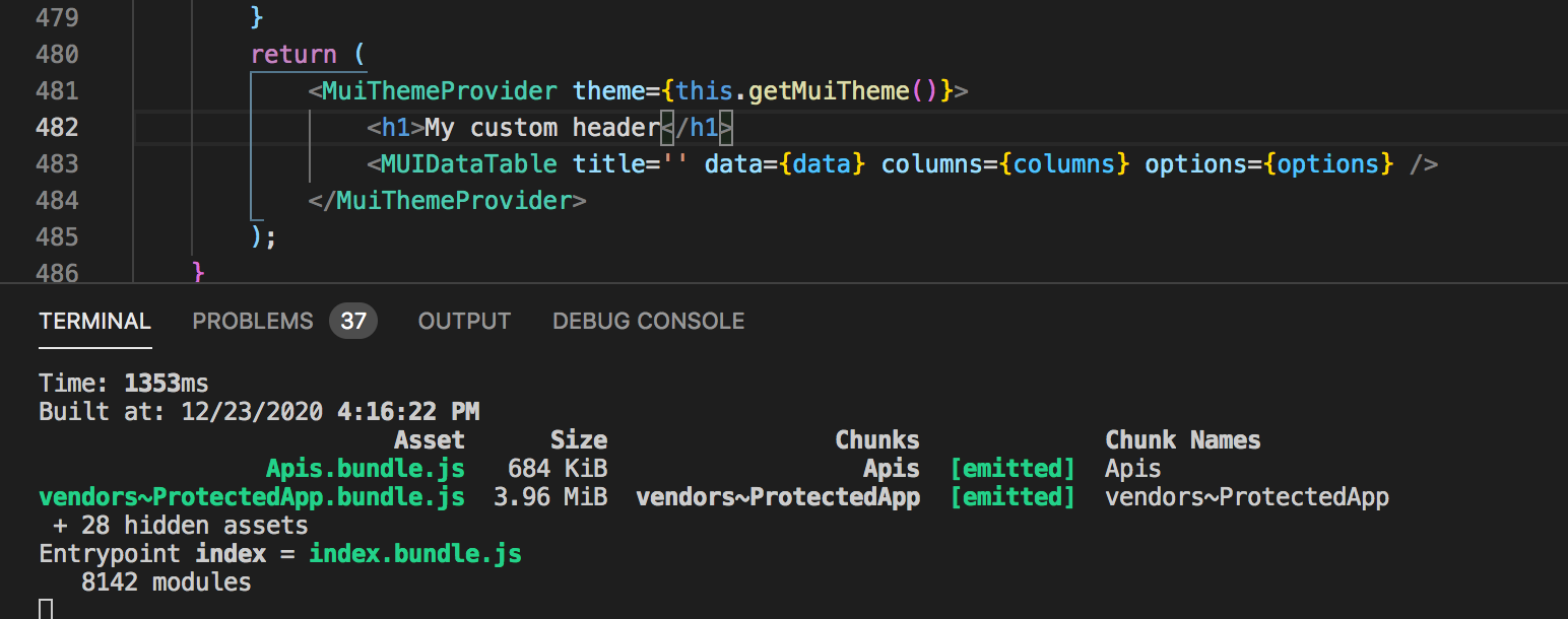
Note that the continues running npm build triggers.
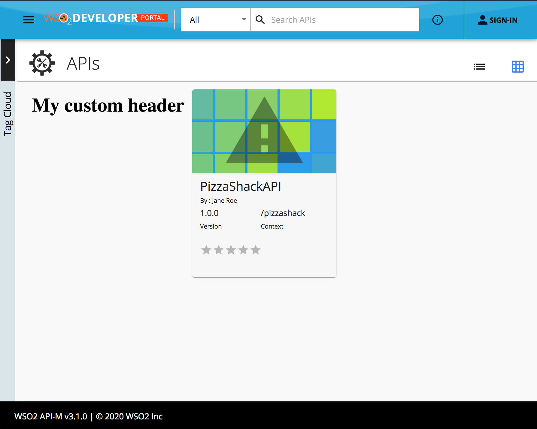
Now refresh the "devportal" listing page and view the changes you made.
-
Step 4 - Build for production
When you finish customizing the portal, You can run the following command to trigger a webpack production build
This will generate minified and optimized JS bundles innpm run build:proddevportal/site/public/distdirectory and these bundles will contain the customizations you have put in the override directory. If you want to apply the same customizations to other API Manager instances, simply replace this directory. No server restart is necessary.
Example 2 - Adding a new page to API details section ( publisher )
-
Step 1 - Find the file responsible for rendering the left menu.
The same steps from example 1 can be applied to locate the source files for the publisher app.
We can identify that the component/file we need to override is source/src/app/components/Apis/Details/index.jsx.
-
Step 2 - Now let's override the index.jsx.
Let's make a copy of this file into the following location.
overrides/src/app/components/Apis/Details/index.jsxSince we add a new file, we need to restart the npm build to let the changes take effect. build
npm run build:dev -
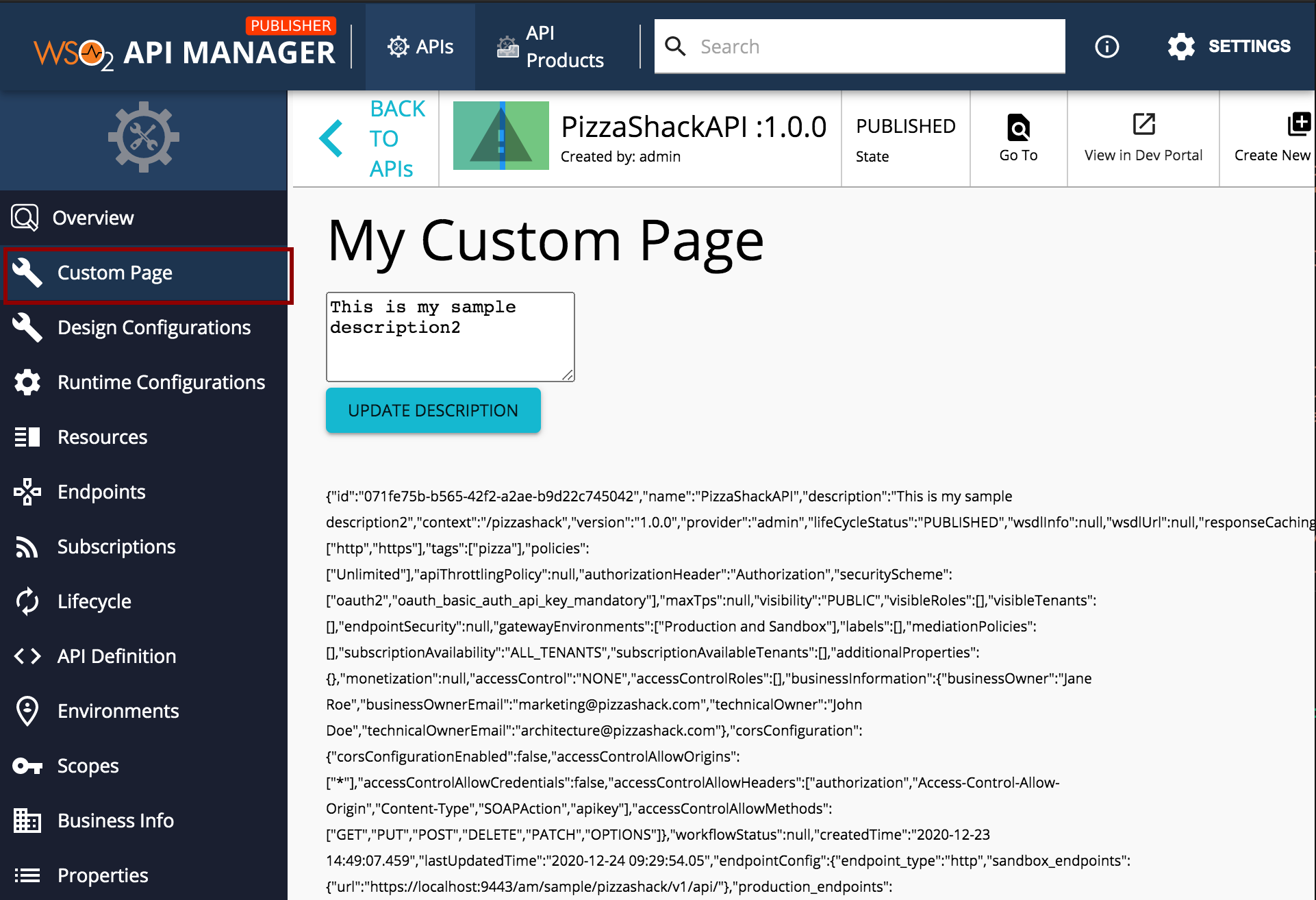
Step 3 - Add the custom component.
Add the new file (overrides/src/app/components/Apis/Details/CustomPage.jsx).
/* eslint-disable require-jsdoc */
import React from 'react';
import Box from '@material-ui/core/Box';
import Typography from '@material-ui/core/Typography';
import Button from '@material-ui/core/Button';
import { APIContext } from 'AppComponents/Apis/Details/components/ApiContext';

export default function CustomPage() {
    const { api, updateAPI } = React.useContext(APIContext);
    const [displayAPI, setDisplayAPI] = React.useState({ ...api });
    const [newDescription, setNewDescription] = React.useState(displayAPI.description);
    React.useEffect(() => {
        setDisplayAPI(api);
    }, [api]);
    const updateDescription = () => {
        updateAPI({ description: newDescription });
    };
    return (
        <Box width={600}>
            <Typography variant='h3'>My Custom Page</Typography>
            <br />
            <textarea onChange={(e) => setNewDescription(e.target.value)} rows='4'>{newDescription}</textarea>
            <br />
            <Button variant='contained' color='primary' onClick={updateDescription}>
                Update description
            </Button>
            <br />
            <br />
            <br />
            <Typography variant='caption'>{JSON.stringify(displayAPI)}</Typography>
        </Box>
    );
}
Note
This simple example is updating the API description. It demonstrates the usage of APIContext to view and update the API.
-
Step 4 - Link the new Component to left menu
Now update the overrides/src/app/components/Apis/Details/index.jsx file as follows.
-
Import the new page.
import CustomPage from 'AppOverride/src/app/components/Apis/Details/CustomPage'; -
Add a new entry to the left side menu.
<LeftMenuItem text={intl.formatMessage({ id: 'Apis.Details.index.custom.page', defaultMessage: 'Custom page', })} route='custompage' to={pathPrefix + 'custompage'} Icon={<ConfigurationIcon />} /> -
Define the route
<Route path={Details.subPaths.CUSTOMPAGE} component={() => <CustomPage api={api} updateAPI={this.updateAPI} />} /> -
Add the "CUSTOMPAGE" constant to the "Details.subPaths" JSON
Details.subPaths = {
.
.
    CUSTOMPAGE: '/apis/:api_uuid/custompage',
.
.
}
-
-
Step 5 - Now refresh the publisher app to see the changes in action.
-
Step 6 - Build for production
When you finish customizing the portal, You can run the following command to trigger a webpack production build
This will generate minified and optimized JS bundles innpm run build:prodpublisher/site/public/distdirectory and these bundles will contain the customizations you have put in the override directory. If you want to apply the same customizations to other API Manager instances, simply replace this directory. No server restart is necessary.
Example 3 - Add a new input parameter to API create page ( publisher)
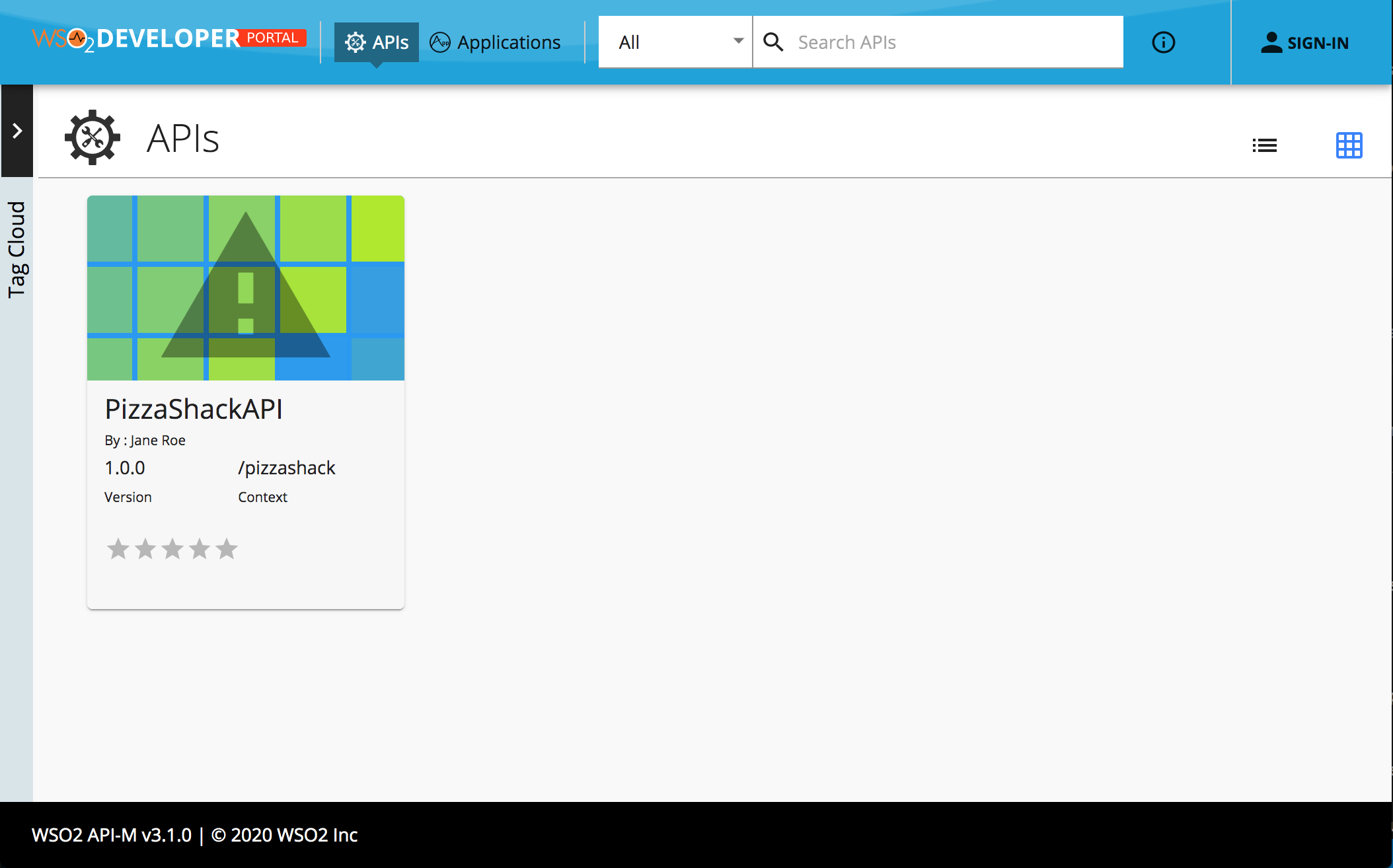
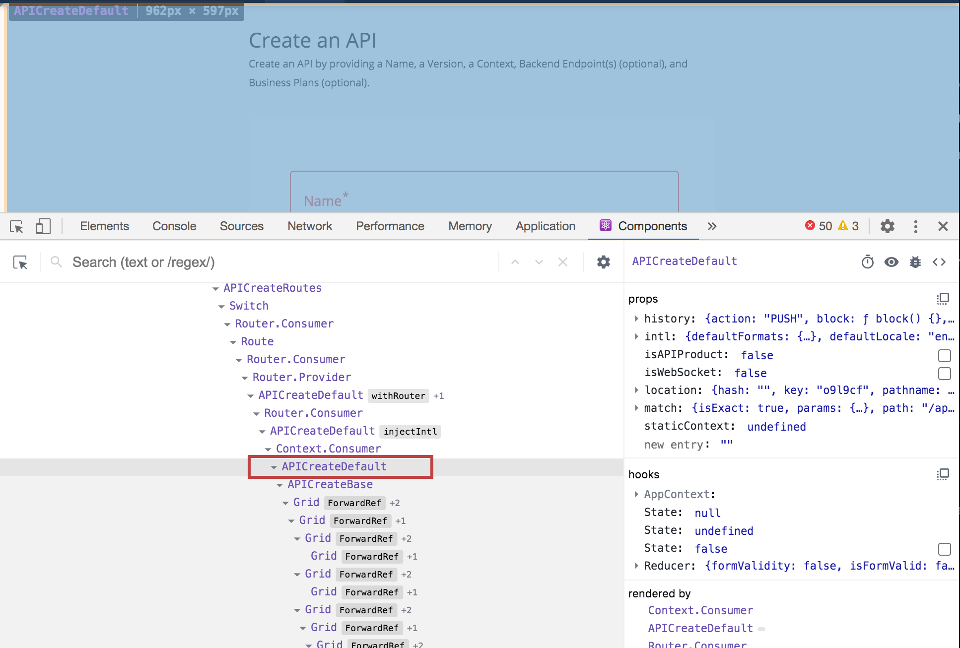
Let’s assume you want to add a new input parameter to API create page. Where API developers can provide a Github repository URL as a reference for API consumers. So that API consumers or application developers who are interested in this API can explore the code in the Github repository and bootstrap their work. Let’s see how the Publisher API create page UI looks like after making the customization.

-
Step 1 - Find the file responsible for rendering the create API view.
We are going to add the input field that is marked with the red rectangle. The same steps from the first example can be applied to locate the file or React component that is rendering the segment that you want to customize.
-
Step 2 - Creating the custom React component We can identify that the component/file we need to override is
source/src/app/components/Apis/Create/Default/APICreateDefault.jsxLet's make a copy of this file into the following location.
overrides/src/app/components/Apis/Create/Default/APICreateDefault.jsxSince we add a new file, we need to restart the npm build to let the changes take effect.
Explore the createAPI() method in APICreateDefault.jsx. It's possible to modify this and pass additional parameters from here to the RestAPI while creating the API.npm run build:dev -
Step 3 - Build for production
When you finish customizing the portal, You can run the following command to trigger a webpack production build
This will generate minified and optimized JS bundles innpm run build:prodpublisher/site/public/distdirectory and these bundles will contain the customizations you have put in the override directory. If you want to apply the same customizations to other API Manager instances, simply replace this directory. No server restart is necessary.